Our brand
Our vision is for an equitable and thriving Aotearoa through learning. Our brand identity brings life to our narrative and is reflective of our kaupapa.
Honouring Te Tiriti with our name
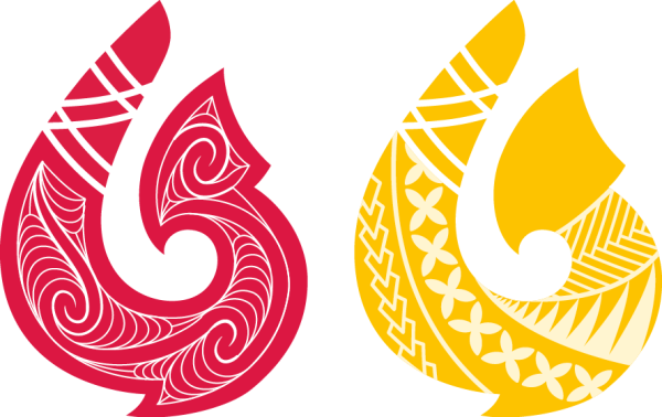
Putting our Māori name first, Tātai Aho Rau CORE Education, reflects our commitment to te reo Māori. Our name and the matau (fish hook) is a metaphor that reflects where we are going, our kaupapa, who we work alongside and advocate for.
In April 2023, we changed our name (originally CORE Education Tātai Aho Rau, now Tātai Aho Rau Core Education). We designed a new icon to represent our brand, our people and our mahi - the matau.
Each part of the Tātai Aho Rau brand has been carefully crafted - from the matau and the Foafoa (conch shell), to the patterns inside the matau and the colours.
Gathering the perspective of those we work alongside was an important part to the changes. We co-designed a narrative and worked with groups to gather their whakaaro. We mihi to those who supported our journey.
The narrative supporting the logo
![]()
For centuries, Māori and Pacific peoples have used matau as fishing tools. Fashioned from shark teeth, wood, bone, shell, or stone, their ornate designs reflect each makers’ creativity. There is no one size fits all. A different matau is chosen for each fish and fishing spot. Fishers may collaborate to share and select the best matau shape.
Fishing is a means to feed a community, and also maintain relationships.
Sharing stories and knowledge while fishing helps to ensure fishing spots remain sustainable.
The new logo for Tātai Aho Rau incorporates a matau. The matau locates us in the Pacific and connects with the idea of selecting the right tools for our mahi.
We honour our whakapapa by incorporating our previous logo, the koru, into the new.
The matau also connects us with the ideas of innovation and creativity, collaboration and connectedness, expertise and enterprise – all concepts that strongly resonate with the new direction. Tātai Aho Rau Core Education kaimahi draw on all of these when they work alongside clients, organisations, and communities to create products, and deliver professional learning services, that will make the biggest equitable impact for learners.
The raperape pattern
Raperape is a Māori interlocking spiral pattern based on movement.
It represents energy, evolution of life, new beginnings, new pathways and flow of transition from one to another.
The Pacific pattern
The Pacific patterns on the matau represent the environment around us - weave (strong bonds), flowers (new beginnings) and centipede (courage).
The Foafoa (conch shell)
 The Foafoa (conch shell) is a supporting element that we use across our visual identity. It connects Māori and Pacific cultures in a visual representation of our vision and values. Acknowledging our leaders within the business and the kaupapa we work alongside, the sound of the conch shell creates a ‘loud call’ of support and advocacy in Aotearoa. The foafoa is a metaphor representing every voice in a community. Allowing those with even the smallest voices to be heard through the call of the conch shell.
Our Tātai Aho Rau Core Education values are represented through the carefully selected patterns marking the conch shell. Symbols of courage, joy, prosperity, abundance, community and the footprints of our ancestors decorating the conch shell as a visual representation of the heart of Tātai Aho Rau.
The patterns acknowledge the environment around us, and from top to bottom are: the Faavaetuli (the tuli bird’s footprint), ocean, spearhead, flowers, weave, fish, and centipede.

